Choosing Color Schemes
Brianne Neumann's color scheme overview
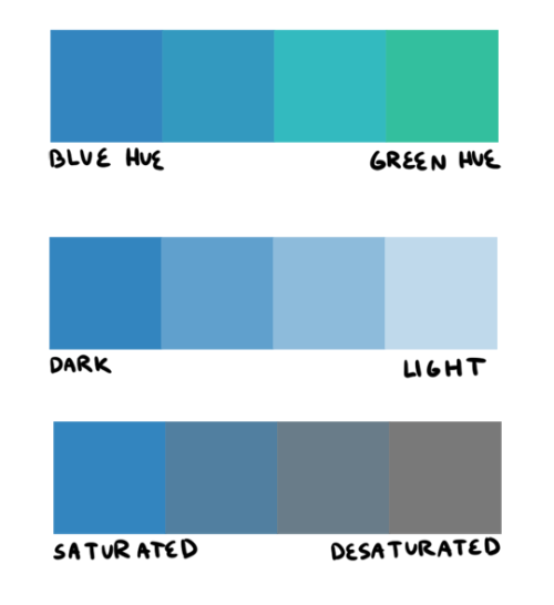
firstly, i want to go over hue, value, and saturation. i’m sure everyone knows these intuitively but i want to explain them in words. hue, value and saturation are what make up a color, and decide how colors differ from each other. [1]
hue: what color the color actually is. red, purple, green, yellow, and everything in between.
value: how light or dark a color is. if you’re painting traditionally, adding more white or more black to a color lowers or raises its value.
saturation: how “pure” the color is vs how much neutral tone is in it.
here’s an example of all three:
this comes into play because a big mistake i see beginners make is that they pick a “just” color, and by that i mean they pick “just blue” or “just yellow”. imagine buying a set of oil paints and only using paints straight from the tube without ever mixing. it would be impossible! so i try to avoid picking “just” colors, except as for a complementary color (more on that in a bit). here are some variations of a red, for example.
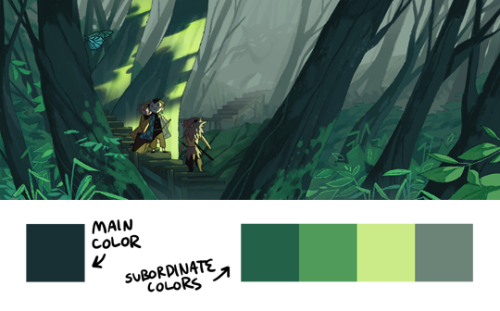
so, the biggest thing for me when i pick colors is that i want them all to be friends. i want them all to have something in common so that they get along. i usually lose control of a painting when my colors feel to different from one another. so, i will usually start a painting with one color i know for sure i want, and “subordinate” other colors to it, meaning every other color i pick has to look good with that color. as to how you figure out what looks good and what doesn’t, that just takes time and lots of observation to build a personal opinion :) here’s an example from one of my paintings. in this case, the main color is the trees.
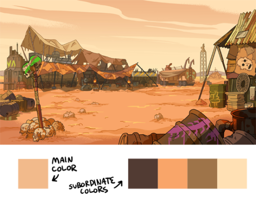
and here’s another from rick & morty, the main color is the sky this time.
now that that’s out of the way, i’m going to give you the Actual Cheat Sheet for color palettes. in color theory, there are 8 basic color schemes that are generally pleasing to look at.
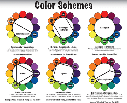
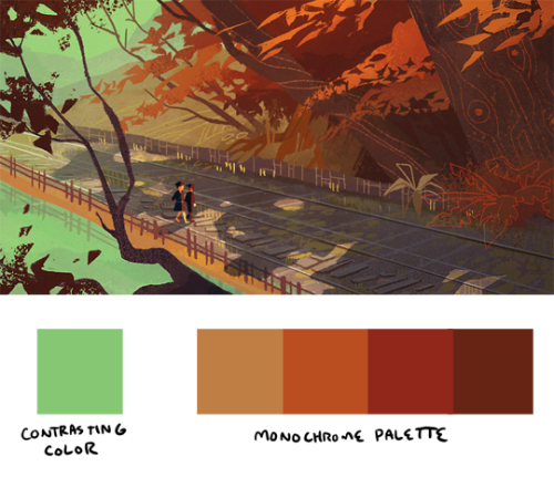
i usually use an analogous palette or monochrome palette out of preference. the two examples above more or less fall into those categories. however, i also like to use split complementary because the complimentary color adds a LOT of contrast and visual interest. it’s great to use if you have a specific thing in a painting you want to draw attention to. here’s an example:
it doesn’t always have to be a perfect split complementary, just one color that differs from the “family” of colors that take up a majority of the piece.
now! you might be wondering when’s the right time to subordinate a color, or where to put it, or how much of it to use, etc. and the answer is: CONTRAST. there is always visual interest in things that are different. i was rifling through my school notes and found these great types of contrast when working with color.
value: things that are light vs things that are dark.
hue: two colors that look different. I.E. yellow vs blue.
saturation: things that are saturated vs things that are desaturated.
proportion: note the example above. a majority of the painting is orange, so the green stands out because there is proportionally less of it.
temperature: things that are warm vs things that are cool.
complementary: red vs green, blue vs orange, yellow vs purple. when in doubt, these colors always contrast against each other because they have nothing in common (there is no red in green, etc).
simultaneous: this is a little advanced and i’m bad at explaining it, so please read up on it here.
a super helpful exercise is to look at your favorite illustrations, paintings, photographs, designs, etc and assess which one of the 8 color schemes (linked above) it has, and which types (can be more than one) of contrast it has. we did this in school and it REALLY helped me look at color better. here’s part of the assignment i did, the artist is annette marnat.
